 Presenting my newest website project. Take a look.
Working for CMS, designer/art director Kay Krenek and I delivered Vision Reservoir’s new site cum simplicitate…simple rather than complex; readable rather than dense…lots of white space. Instead of data-heavy, it’s brand-oriented.
The geoscientific marketplace is an issue. It’s jam-packed. There are a number of well-known oilfield exploration and production software companies that have spent years accumulating products and data. And they put everything on their websites. Everything.
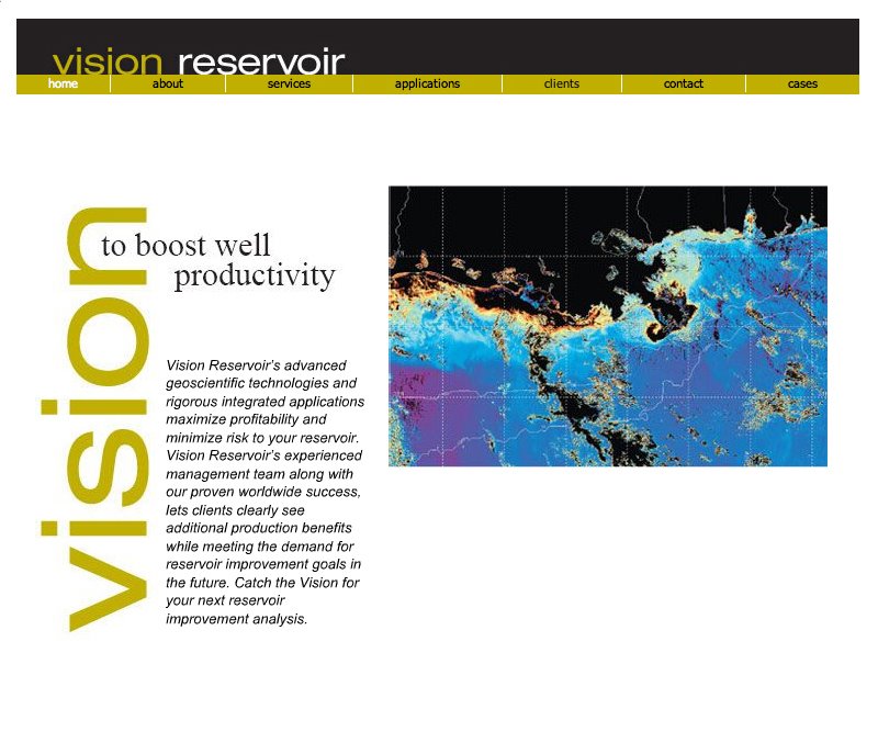
Vision Reservoir’s site is…cleaner. The company was renamed, shortening a much longer and more technologically complex name (see below). To break through the clutter, we extended this concept to emphasize what the company means by the word “Vision.”
The home page rotates among four different views, from earth orbit to deep geology: a satellite photo of an offshore field right down to a stratum of rock…to which we have added four different headlines. Each headline highlights a different role the company plays in reservoir remediation and productivity. Each one is founded on “Vision” for brand reinforcement.
We continued the concise design and copy throughout the site, emphasizing the brand name. There is enough information to explain but not overwhelm. (First, build the house; then decorate it. CMS’s Donna Giles did the hard-slogging work of assembling and organizing.)
Christine Reel, CMS Principal says: Actually, Kay Krenek (designer extraordinaire) provided the impetus to either: a) shorten the really lengthy corporate name that no one used; or b) add substance to the short four initials that were used with no reference. Her suggestion proved to be the cornerstone for a very effective re-branding initiative.
The most memorable and delightful vignette of the process was the presentation of four web concepts – each considered to be perfect and wonderful by the client. The “Vision” concept ultimately won out and is now providing a visually arresting and compelling site.
This is one of those client projects that went so well we can all bask in the afterglow.
Borrowing a line from another design industry professional, Susan Kirkland: “There are many things an art director relies on other professionals for, but none of them should involve decisions about how art supports copy or copy supports mission.”
In the new Vision Reservoir website, design and copy both support...clarity. With an afterglow.

1 comment:
I really like the flow and look of the Vision Reservoir site. Brian Bearden, Zephyr Salvo Studios.
Post a Comment